Normal Distribution to Percentile Visualizer
Parameters
Calculations
Normal Distribution Curve
Percentile Result
Value Result
Statistical Information
Empirical Rule Reference:
The normal distribution percentile graph is a powerful tool that shows where a data point, like a test score or height, stands on a bell-shaped curve. By plotting your score and shading the area under the curve, this bell curve percentile tool reveals the percentile—how your value compares to others in a normal distribution. It’s perfect for students learning statistics, teachers creating engaging lessons, test-takers interpreting scores, or statisticians analyzing data. Combining percentiles with a visual curve makes learning interactive and intuitive. Ready to see your data in action? Try our main statistics tool to explore normal distributions.
What Is a Normal Distribution Percentile Graph?
A normal distribution percentile graph displays a bell-shaped curve, also known as a normal distribution, where data clusters symmetrically around the mean (average). The graph shades the area under the curve up to a specific data point, and this shaded region represents the percentile—the percentage of data below that point. For example, if a score is at the 75th percentile, 75% of the data lies below it.
Percentiles show how rare or common a value is in a dataset. A high percentile (e.g., 95th) means your score is better than most, while a low percentile (e.g., 10th) indicates it’s below average. This normal distribution visualization helps you instantly grasp your data’s position, whether it’s an exam score or a medical measurement. For a deeper dive into percentiles, check out percentile concepts.
How to Use the Visualizer Tool
The percentile graph calculator is easy to use and creates a normal curve shading tool for your data. Here’s how it works:
Enter the Mean (μ): Input the average of your dataset (e.g., 100 for test scores).
Input the Standard Deviation (σ): Enter the standard deviation to show data spread (e.g., 15).
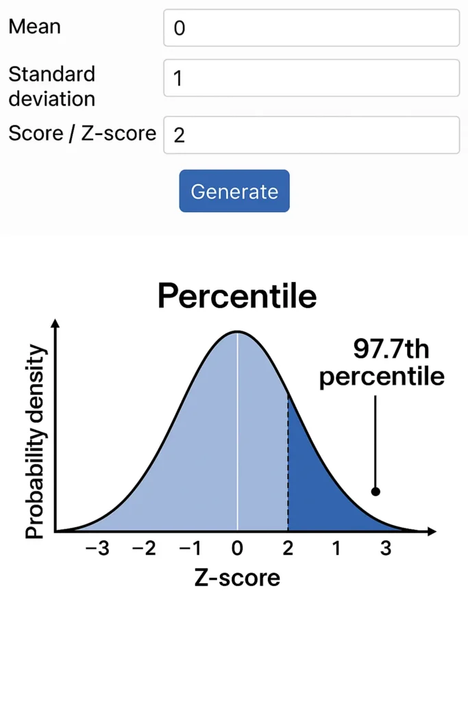
Enter the Raw Score or Z-Score: Input your score (e.g., 130) or a z-score (e.g., 2). If you provide a raw score, the tool calculates the z-score: ( Z = \frac{x – \mu}{\sigma} ).
Generate the Graph: The tool plots a bell curve, marks your score, and shades the area under the curve up to that point, showing the percentile.
View the Percentile: The output includes the percentile (e.g., 97.7% for a z-score of 2).
Example: For a test with a mean of 100 and standard deviation of 15, a score of 130 has a z-score of (130 – 100) / 15 = 2. The graph shades the area up to 130, showing it’s in the 97.7th percentile, meaning 97.7% of scores are below it. For more percentile calculations, try our percentile calculator.
Why Visualizing Percentiles Matters
Visualizing percentile on normal curve helps make statistical concepts clear and practical. Here’s why it’s valuable:
Simplifies Interpretation: Seeing a shaded area under the curve makes it easy to understand where a score stands.
Exams and Grading: Students and test-takers can see how their SAT or GRE scores rank compared to others.
Medical Scores: Professionals can interpret metrics like IQ or cholesterol levels, where normal distributions are common.
Intuitive Insights: Visuals are more engaging than raw numbers, helping users grasp data significance.
For example, a test score in the 90th percentile is instantly recognizable as exceptional when shown on a standard deviation percentile plot. To explore practical uses, check out real-world percentile applications.
Benefits for Teachers and Educators
This normal distribution percentile graph is a fantastic classroom tool for teaching statistics:
Demonstrates the 68-95-99.7 Rule: Show how 68%, 95%, and 99.7% of data fall within one, two, and three standard deviations.
Visualizes Standard Deviation Zones: Highlight areas like ±1σ to explain data clustering.
Teaches Key Concepts: Illustrate how values fall in the tails (extreme percentiles), the difference between percentiles and z-scores, and the curve’s symmetry.
Engages Students: Interactive visuals make lessons more memorable and understandable.
Teachers can use this to show students how a score ranks or why certain values are rare. For related calculations, try our z-score tool .
Z-Score vs. Percentile – Visual Comparison
- Z-Score: Measures how far a data point is from the mean in standard deviations (e.g., z = 1 is one standard deviation above the mean).
Percentile: Shows the percentage of data below a point (e.g., z = 1 is the 84th percentile, meaning 84% of data is below it).
FAQs
The shaded region in a normal distribution percentile graph shows the percentage of data below your score, representing its percentile.
Yes, as long as the data follows a normal distribution, the normal curve calculator accurately visualizes percentiles based on mean and standard deviation.
Yes, negative z-scores or scores below the mean work fine, showing percentiles below 50% (e.g., z = -1 is the 16th percentile).
A normal curve shading tool provides a visual representation, making percentiles easier to understand than numbers in a z-score table.
This tool assumes a normal distribution. For non-normal data, use tools like our rank calculator instead.
Conclusion
The normal distribution percentile graph is a game-changer for visualizing where your score stands on a bell curve. By shading the area under the curve, this normal curve shading tool makes percentiles intuitive, helping students, teachers, test-takers, and statisticians understand data rankings in normal distributions. Whether you’re analyzing exam scores, medical metrics, or standardized tests, this tool bridges theory and reality. Start with our main statistics tool to explore further, and enhance your learning with tools like the percentile calculator , z-score tool , rank calculator , percentile concepts , or real-world percentile applications for a complete statistical experience.
Empirical Rule Graph Generator
Visualize the 68-95-99.7 Rule with a bell curve showing standard deviation intervals. Great for quick insights and presentations.
Try CalculatorBell Curve Generator
Create customizable bell curve plots for any normal distribution. Perfect for data analysis and visual reports.
Standard Deviation Shading Calculator
Shade areas under the curve based on standard deviation. Instantly see data coverage between values.
Try CalculatorZ-Score to Graph Plotter
Plot Z-scores on a bell curve and see where your value lies. Understand percentiles and probabilities at a glance.
Try Calculator